Bottle-Label Combos That Hook Buyers
Designers and clients match bottles with paper labels and direct-print for wine packages that impress
Despite incursions from alternative packages like bag-in-box, pouches and cans, most wine still arrives in glass bottles that mimic the standard shapes and colors established centuries ago. Many of the reasons for this involve marketing concerns.
Traditional bottles present important cues to buyers: What varietal is the wine? Is it white, rosé or red? Are the bottles easy for retailers to display, and do they fit conveniently in home wine racks and refrigerators? Wineries may opt for an embossed bottle, but they rarely adopt the innovative shapes and finishes that are commonplace for liquor and perfume packages.
Inconvenient, messy, wet-glued labels have largely—but not entirely—been supplanted by their roll-fed, self-adhesive counterparts. Pewter and wood-laminate labels are now available, largely adopted for high-end custom packages. Moisture-resistant label stocks protect packages from condensation and ice-bucket service.
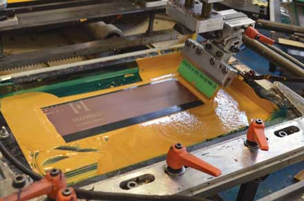
In the past decade, direct on-bottle screen printing has become wildly popular. This durable format provides designers with a larger canvas for imaginative branding using virtually every inch of bottle surface for design. It saves time on the always-worrisome bottling line, but because bottles are printed before the wine is bottled, over- or under-runs are not unlikely.
We consulted established wine packaging designers and their clients to learn how successful bottle/label (paper or direct print) combinations can forge the right bond.
All scream for screen print
Availability and technology has brought screen printing to the forefront during the past decade. Screen-printed bottles are thought to convey a high-end look even to value-priced wine brands, while maintaining reasonable costs.
Mill Valley, Calif.-based designer Jim Moon of Jim Moon Designs singled out his package for Ceviche, an “entry level Sauvignon Blanc aimed at people who are new wine drinkers.” It’s one of several packages Moon has designed for 65,000-case Anders-Lane Artisan Wines in Napa, Calif.
“The idea was a food-pairing concept, hence the fish graphic,” he said. “The silk-screening approach worked particularly well with the flint bottle and the wine. I supported the fish theme in the screw capsule with a net and the copy line, ‘Catch of the Day.’
“It was a genuine challenge for the silk-screen vendor, Universal Packaging (of Vernon, B.C.). It required feathering each fish on top of the other. We also had to lay down an opaque white first, then put down the color values. It was the first time this had been done,” the designer said. “Feathered fish” may be a novel concept, but pairing with ceviche is indeed appetizing.
Paula Sugarman of Sugarman Design Group in Fair Oaks, Calif., nominated a screen-print bottle she designed for 200,000-case St. James Winery in Missouri. St. James marketing director Ann Miller was looking for her wine to stand out among other midwestern producers.
Although the St. James Riesling bears an Ozark Highlands designation, it is made with grapes imported from Washington. “We were interested in really differentiating our wines from the other regional offerings, and screen printing (with an awesome design) was the way to do that,” Miller said. Both the bottle and the screen printing were provided by Vitro Packaging; screwcaps are from Guala.
“Our executive winemaker is from New Zealand, where they have embraced the use of screwcaps. We moved to screwcaps over 10 years ago,” Miller said. She reported that customers and distributor partners embraced the design and package change right away.
Sugarman said her mission was to create an updated, eye-catching brand identity for St. James’ Frontier Selection wines. “It was important to maintain brand recognition with a visual connection to their existing wines, which enjoy a great reputation in the region,” she told Wines & Vines.
To achieve that, Sugarman Design Group refreshed the St. James logo, starting with a font that was designed in the 1980s. “We reworked the letters, creating a new shape that draws the eye in. In the studio, we call this a bull’s eye.”
While Sugarman sought a more sophisticated look for St. James, David Hanson-Jerrard of 4Parts Design in Sausalito, Calif., went “rustic” in his design for 5,000-case Newsome-Harlow Winery in California’s Gold Country. “There is a rustic feel to the whole environment,” he said.
“Scott Klann, the owner and winemaker, has an accompanying rich history in the Foothills wine industry and sources from some amazing vineyards up and down the Highway 49 corridor,” Hanson-Jerrard said. “The goal in developing the packaging for this range of wines, which are primarily sourced from single vineyards, was to project the character of the individuals/environments from where the grapes were grown.”
His major challenge was to evoke the history and quirkiness of each vineyard and wine while elevating the packaging to the price-point of the wines: $35 to $40 per bottle. “Key to the series was to ensure the consumer could readily identify each of the wines within the range,” according to Hanson-Jerrard.
The screen printing brought an additional challenge, he said. He aimed to authentically replicate the winery’s wall “without it being highlighted in a block form and overwhelming the core design elements.” Hanson-Jerrard worked closely with Monvera Glass Décor to translate the design correctly on the glass.
Put it on paper
Paper labels have been around forever—or at least a long time—but that doesn’t mean they have lost their cutting edge.
Jim Moon said, “In my opinion, the Sauvignon Blanc package design for 75,000-case Honig Vineyard & Winery represents my best marriage between bottle and labeling. It seems to get the most attention.”
Elaborate labels on a clear bottle showcase the chilled wine within, with a wrap-around, stylized vineyard scene overlaid with a metallic gold-lettered Honig label (Honig means “honey” in German). Decorative and inviting, the package graphically says “refreshing.”
The design process was, however, “like delivering an elephant,” Moon said. It involved many rounds of changes and was the only time a client press-proofed a job.
“What that entails is actually printing, embossing, foiling and die-cutting each label before the final label run. Honig was willing to spend the money to test each label and mount them on bottles. From there, the designs were fine-tuned. Epson proofs or handmade mocks were out of the question. They wanted to sign-off on the real thing,” Moon recalled.
A through-the-bottle look required that back labels be printed on two sides. The scene is Honig’s Rutherford vineyard, illustrated by Tom Hennessy.
“This label goes on via glue label applicators. A special glue had to be formulated so it did not ‘yellow’ the illustration. The illustration also had to be tweaked to account for the yellow value of the wine. The small square face label is actually registered with the back label illustration,” Moon said.
“I wanted the illustration to align with the back label illustration as if you were seeing it through a window. There is a lot going on in the front label (foil, embossing, graduated screens (from dark to light). The front label also has to land on just the right spot on the bottle.”
The back label is printed on two sides on a huge eight-color Heidelberg sheet-fed press. Labels are printed on large press sheets and die-cut for glue label application. The face labels are printed on pressure-sensitive label stock and applied by Honig’s new bottling line at the Rutherford winery. “I have a feeling they might have one of the few bottling lines that can simultaneously apply glue and pressure-sensitive labels,” Moon said.
Another paper-label stunner is “inconceivable” but true. The Inconceivable brand belongs to 20,000-case Cadaretta of Middleton Family Wine Estates in Walla Walla, Wash. According to marketing director David Anthony Hance, Middleton had a hole in its portfolio: no Chardonnay.
After sourcing grapes from California’s Central Coast, the winery developed an imaginative package with DG Creative Branding in Grants Pass, Ore. Evoking the fantastic adventures recounted in the classic 1987 film “The Princess Bride,” it’s a full-bottle, wrap-around printed treasure map customized for each vineyard offering.
The wrap-around label invites consumers to explore, to turn it around and travel through a fantastic realm, Hance said. “They can’t see it all at once. They have to pick it up and turn it around.” The brand itself is oddly interactive. “Seven out of 10 people will say ‘Inconceivable,’ in the signature lisp of Wallace Shawn’s character in the movie,” Hance reported.
Advised by a designer three years ago that screen print may have lost its edgy allure, Middleton opted for a paper label. This brought about other adventures in packaging.
“A long time ago everything was wet (glue) labels,” Hance recalled. “Now, its all pressure sensitive. We calculated the length of a full-wrap label,” but even on standard bottles, application proved daunting. The label must match up on the back.
After experiments with printer Digital Dogma in San Luis Obispo, Calif., the winery decided to run 15% extra labels to accommodate bottling line difficulties. “They aren’t that expensive to print,” Hance explained.
Mobile bottlers Castoro Bottling Co. of San Luis Obispo and Bugle in Walla Walla, Wash., have to add staff to perfect application of the wraps, according to Hance. Bottles are sourced from Tricor Winepack; screwcaps from Stelvin. “Screwcaps encourage turning the bottle,” Hance noted.
The package was intended to be a bit of a retro throwback, he said. It’s making a splash: Already distributed in 20 states, Inconceivable will be available in 35 states next year, doubling the current production of 1,000 cases.
An enduring union
In 1996, Tony Auston at Auston Design Group of Emeryville, Calif., was the designer for 2.1 million-case Bogle Vineyards’ now-familiar package. Auston recalled the evolution of the Clarksville, Calif.-based winery’s ovoid label and the bottles it adorns.
“The unique shape of the Bogle Vineyards label wouldn’t look right on just any standard wine bottle shape. The unique (and now iconic) rounded egg shape required just the right bottle shape. Great care went into researching and testing the available stock molds that would be the most appropriate fit to complement our design and were within the desired price range of our client,” he said.
“The original design launched with the Etude mold for the Cabernet Sauvignon and Merlot, the Symphony mold for the Chardonnay and Chenin Blanc, and the Madeline mold for the Petite Sirah. We made a slight change from flint to a Coke bottle green Etude-like mold and color modification for the Sauvignon Blanc in the mid-2000s. Other than that, this marriage of label to bottle has endured the test of time and has not changed since we re-launched the brand in 1996,” Auston said.
Genius in the bottle
As we noted above, wineries have been reluctant to adopt the novel shapes so common among spirits brands, but European glass producers continue hopefully to offer new options.
Napa’s Global Packaging LLC showed its elegant Doble Alto bottle at the 2015 Unified Grape and Wine Symposium in January. Manufactured by Estal, “It uses very new technology to create a thick base area and a very deep, angular punt,” said Global president Erica Harrop, who suggested it would be used for high-end wines and spirits. At this point, it’s not yet employed by any North American wineries.
SGP Packaging Corp. also has an attractive bottle concept in use by several French wineries but not yet in North America. With interior embossing, the glass can provide another dimension to package design without interfering with label application or the screen-print process. A stock pattern is available, but 100% custom molds are also possible.
The interior patterns are visible whether or not the bottle is full, according to SGP marketing and account manager Isabelle Le Graet.
Wrap it right
Maverick Enterprises of Ukiah, Calif., recently launched its Full Body Sleeve (FBS) to provide “a branding solution that incorporates design 360° around the bottle,” according to Shelby White, marketing coordinator for Maverick.
The sleeve can include all information normally displayed on wine labels, combined with eye-catching artwork to make the product stand out on display shelves.
Sleeves are applied in a steam tunnel prior to filling on the bottling line, White said. Maverick has “multiple options and facilities to apply on the empty bottles” and can provide customers with the pre-printed material and application sources.
The FBS can be applied to all styles of bottle. “No special specifications are needed,” White said. Clients may provide their own designs, and/or work with Maverick designers to maximize impact. Turn-around times are four to six weeks.
White commented that although industry pricing is “hard to analyze, from what I have seen Maverick is successfully able to manufacture sleeves at a fraction of the cost of screen printing.”
The FBS is manufactured in a PET bio-based material that is recyclable, she said. Consumers can recycle the bottle and the wrap together.
|
|
PRINTER-FRIENDLY VERSION » |
|
|
E-MAIL THIS ARTICLE » |